Have you ever found yourself irresistibly drawn to a snack just because of its packaging? In today’s fast-paced world, instant food isn’t just about convenience—it’s a sensory experience shaped by clever design.
With the rise of online shopping and social media trends, packaging plays a pivotal role in sparking cravings before the first bite even happens. From vibrant colors to tactile textures, every detail is carefully crafted to capture attention and drive impulse buys.
Let’s dive into how instant food packaging taps into our desires and influences what lands in our shopping carts. This insight might just change the way you look at your favorite grab-and-go treats.
Capturing Attention Through Color Psychology
How Colors Trigger Appetite and Emotion
Colors are far more than just visual decoration; they act as emotional triggers that can make us crave certain foods. For instance, warm hues like reds, oranges, and yellows are commonly used in snack packaging because they stimulate hunger and excitement.
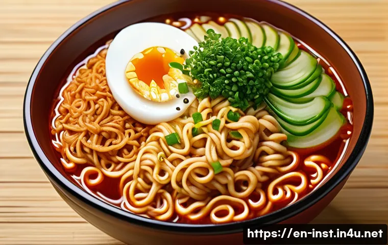
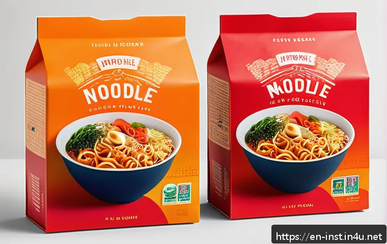
When I recently noticed a new instant noodle brand using a fiery red and orange gradient, I found myself instantly curious, almost as if my brain was nudged to expect a bold, spicy flavor.
This isn’t by accident—marketers know that colors can evoke memories and feelings that influence our choices before we even open the package.
Balancing Brightness and Contrast for Shelf Impact
On crowded store shelves or scrolling through online stores, packaging has to stand out in a split second. That’s why many instant food brands use high-contrast colors and bold fonts to ensure their product doesn’t get lost among competitors.
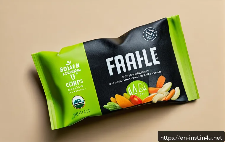
I remember grabbing a bag of chips solely because its neon green background popped against the more muted tones around it. The brightness makes the product feel fresh and exciting, while contrast helps direct your eyes exactly where the brand wants—usually the product name or a tempting image of the snack itself.
Using Color to Convey Flavor and Quality
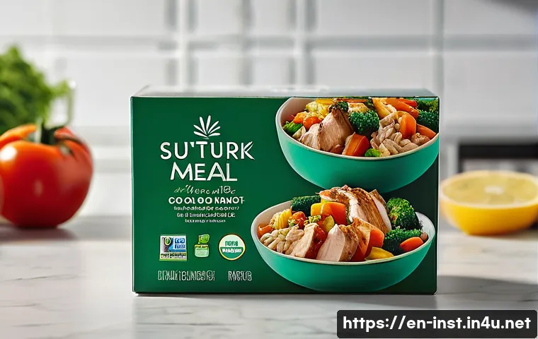
Colors also serve as shorthand for what’s inside the package. For example, green often signals freshness or vegetable-based flavors, while gold or black can hint at premium quality or richness.
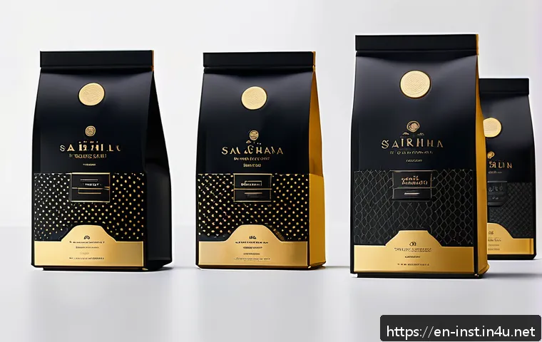
When I picked up a black-and-gold instant coffee sachet, I immediately associated it with luxury and a richer taste, even before trying it. This clever color coding helps consumers make quick assumptions and decisions, often pushing them toward brands that align with their expectations or mood.
Texture and Material: More Than Just a Feel
The Power of Tactile Feedback in Packaging
You might not realize it, but the feel of a package in your hand can sway your purchasing decision. Matte finishes, soft-touch coatings, or embossed logos create a sensory experience that feels more personal and premium.
I once switched brands simply because the new packaging felt smoother and more durable, making the product seem like a better deal or higher quality even before tasting it.
This tactile element builds trust and satisfaction, enhancing the overall impression of the product.
Eco-Friendly Materials as a New Sensory Trend
As sustainability grows in importance, many instant food brands are experimenting with recyclable or biodegradable materials that provide a different texture from traditional plastic.
These materials can feel rougher or more natural, which appeals to eco-conscious buyers. I’ve noticed that when I hold a snack wrapped in kraft paper or plant-based film, it connects me emotionally to the brand’s values, making me more likely to choose it over less sustainable options.
This trend adds a meaningful layer to the sensory experience of packaging.
Interactive Packaging Elements
Some brands incorporate unique textures like raised patterns, perforations, or resealable features that invite touch and interaction. This not only boosts engagement but also enhances convenience and freshness, which are huge selling points for instant foods.
For example, resealable bags that snap shut with a satisfying click encourage me to buy snacks I might not finish in one sitting, knowing they’ll stay fresh longer.
This kind of thoughtful design turns packaging into a functional part of the product experience.
Typography and Imagery That Speak Volumes
Fonts That Convey Personality and Flavor
The style of text on packaging can communicate everything from fun and casual to gourmet and sophisticated. Handwritten fonts often suggest homemade or artisanal quality, while sleek, modern typefaces give a sense of innovation or health-consciousness.
I’ve found myself drawn to instant meals with playful, bold fonts that suggest a quick, tasty snack, versus more minimalist fonts that feel like they belong to a health food line.
Typography sets the tone before you even read the ingredients.
Using Mouthwatering Visuals to Create Desire
Images of the food itself are critical—they need to be vivid and appealing without looking overly processed. A glossy photo of crispy noodles or gooey cheese can make your mouth water instantly.
I’ve noticed that the best packaging uses close-up shots with a bit of steam or shine to mimic the fresh, just-cooked look. This visual cue taps into our sensory memories and cravings, making it harder to resist grabbing that bag or cup off the shelf.
Icons and Labels for Clarity and Trust
Clear symbols indicating “gluten-free,” “spicy,” or “low-calorie” help shoppers quickly identify whether the product fits their needs or preferences. When browsing online or in-store, these icons save time and build confidence.
Personally, I appreciate seeing certifications or allergen warnings prominently displayed, as it reassures me about safety and quality, influencing my final choice.
Strategic Use of Packaging Shape and Size
Compact Designs for On-the-Go Lifestyles
Instant foods are often purchased for convenience, so packaging that fits easily in bags, desks, or lunchboxes is a big plus. Slim, lightweight pouches or stackable containers make it simple to carry and store.
I’ve switched to brands offering slim snack packs because they fit perfectly in my gym bag without taking up too much space. This kind of practical design aligns perfectly with the fast-paced, mobile lifestyles most consumers lead today.
Unique Shapes to Stand Out and Impress
Some brands experiment with unconventional packaging shapes—like hexagonal tubs or triangular chip bags—to catch the eye and create a memorable impression.
I remember picking up a uniquely shaped instant soup cup simply because it looked different and more fun than the usual round containers. These shapes can also enhance usability, like easier pouring or stacking, adding another layer of convenience that consumers appreciate.
Portion Control Through Size Variations
Offering multiple package sizes—single servings, family packs, or mini snacks—helps brands cater to different needs and occasions. I often choose smaller packs when I want a quick bite without leftovers, while bigger sizes are perfect for sharing or meal prep.
This flexibility not only broadens market appeal but also encourages repeat purchases, as consumers can select the size that suits their lifestyle best.
Emotional Connection Through Storytelling and Branding
Packaging as a Storytelling Canvas
Some instant food brands use their packaging to tell a story—whether it’s about heritage, ingredients, or sustainability. This narrative element creates an emotional bond that goes beyond the product itself.
I’ve felt more connected to brands that share their origin stories or highlight farmers and artisans, making me feel like I’m supporting something meaningful with my purchase.
Personalization and Limited Editions
Limited-time designs or personalized packaging can create excitement and urgency. I once bought a snack simply because the packaging featured a favorite holiday theme, turning an ordinary product into a festive treat.
These special editions tap into our desire for uniqueness and celebration, driving impulse buys and social media sharing.
Building Brand Loyalty Through Consistent Visual Identity
Consistent use of colors, fonts, and logos builds recognition and trust over time. When I see a familiar design, I’m more likely to reach for that product because it feels reliable and familiar.
This visual consistency is a subtle but powerful way to cultivate long-term customer relationships in the crowded instant food market.
Packaging as a Catalyst for Social Sharing
Designs Made for Instagram and TikTok
With social media’s rise, packaging isn’t just for the shelf anymore—it’s a stage for visual storytelling. Bright, eye-catching designs that photograph well encourage consumers to share their snack moments online.
I’ve noticed brands increasingly incorporating quirky illustrations or witty captions that make unboxing or snacking more shareable, turning customers into brand advocates.
Incorporating QR Codes and Interactive Content
Many instant food packages now include QR codes linking to recipes, challenges, or brand communities. This creates a digital extension of the sensory experience and deepens engagement.
I scanned a code on a snack bag recently and found a quick cooking tutorial that enhanced my enjoyment and connection with the product, making me more likely to buy it again.
Encouraging User-Generated Content Through Packaging
Some brands run contests or campaigns asking customers to post photos with their products using specific hashtags. Packaging that highlights these initiatives encourages participation and creates a sense of community.
When I see a hashtag or call to action on the package, I feel invited to join a larger conversation, which adds fun and value beyond just eating the snack.
| Packaging Element | Purpose | Consumer Impact | Example |
|---|---|---|---|
| Color | Stimulate appetite and emotion | Increases impulse purchases through mood triggers | Red and orange gradients for spicy flavors |
| Texture | Enhance tactile experience and perceived quality | Builds trust and premium feel | Matte finish or soft-touch coatings |
| Typography | Convey brand personality and flavor profile | Sets tone and attracts target audience | Handwritten fonts for artisanal vibe |
| Shape & Size | Facilitate convenience and shelf impact | Improves portability and usability | Slim snack packs for on-the-go |
| Storytelling | Create emotional connection | Encourages brand loyalty and meaningful purchase | Origin stories and limited editions |
| Social Sharing | Boost online engagement and brand visibility | Transforms consumers into advocates | Instagram-friendly designs and QR codes |
Closing Thoughts
Effective packaging design goes beyond aesthetics; it shapes how we feel and interact with a product. From color psychology to tactile elements, every detail plays a role in capturing attention and building trust. When thoughtfully executed, packaging not only influences buying decisions but also deepens emotional connections with the brand. Ultimately, it transforms a simple instant food item into an experience worth sharing and returning to.
Helpful Insights
1. Colors can subtly stimulate appetite and set expectations, influencing impulse buys before a product is even opened.
2. Texture and material choices impact perceived quality and can create a memorable sensory experience that builds loyalty.
3. Typography and imagery communicate brand personality and flavor, guiding consumer perception and desire.
4. Packaging shape and size enhance convenience, making products easier to carry and use in everyday life.
5. Incorporating storytelling and social sharing features on packaging fosters emotional bonds and expands brand reach.
Key Takeaways
Packaging is a powerful marketing tool that combines visual, tactile, and emotional cues to influence consumer behavior. Successful designs balance eye-catching aesthetics with functional benefits, making products stand out while meeting user needs. By integrating interactive elements and consistent branding, companies can build lasting relationships with customers and encourage repeat purchases. Thoughtful packaging ultimately elevates the entire product experience beyond mere consumption.
Frequently Asked Questions (FAQ) 📖
Q: uestions about Instant Food Packaging and Its InfluenceQ1: How does packaging color affect my desire to buy instant food products?
A: Colors on packaging are powerful triggers for our emotions and appetite. For example, warm colors like red and orange can stimulate hunger and create a sense of urgency, making you more likely to grab that snack on impulse.
Cooler colors like blue or green often suggest freshness or healthiness, influencing your perception of the product’s quality. From my own experience, I’ve noticed that bright, vibrant packaging makes snacks more appealing when I’m browsing quickly, especially online or in crowded stores.
Q: Can the texture of packaging really change how I feel about a snack before tasting it?
A: Absolutely! The tactile sensation when you hold or touch a package can subconsciously affect your expectations and craving levels. Matte finishes might feel more premium or natural, while glossy surfaces can signal excitement or indulgence.
I once bought a snack purely because the packaging had a soft, velvety texture that made it feel like a treat before I even opened it. This subtle physical interaction can make the product feel more satisfying and tempting.
Q: Why do some instant food packages have unusual shapes or designs?
A: Unique shapes and innovative designs help products stand out on crowded shelves and in digital marketplaces. They catch your eye and create a memorable impression, which can boost impulse purchases.
For instance, I’ve seen snack packs shaped like mini containers or with resealable features that not only look cool but also add convenience, enhancing the overall user experience.
This kind of design speaks directly to our desire for both novelty and practicality, making us more likely to choose that product over others.